Community & Connection
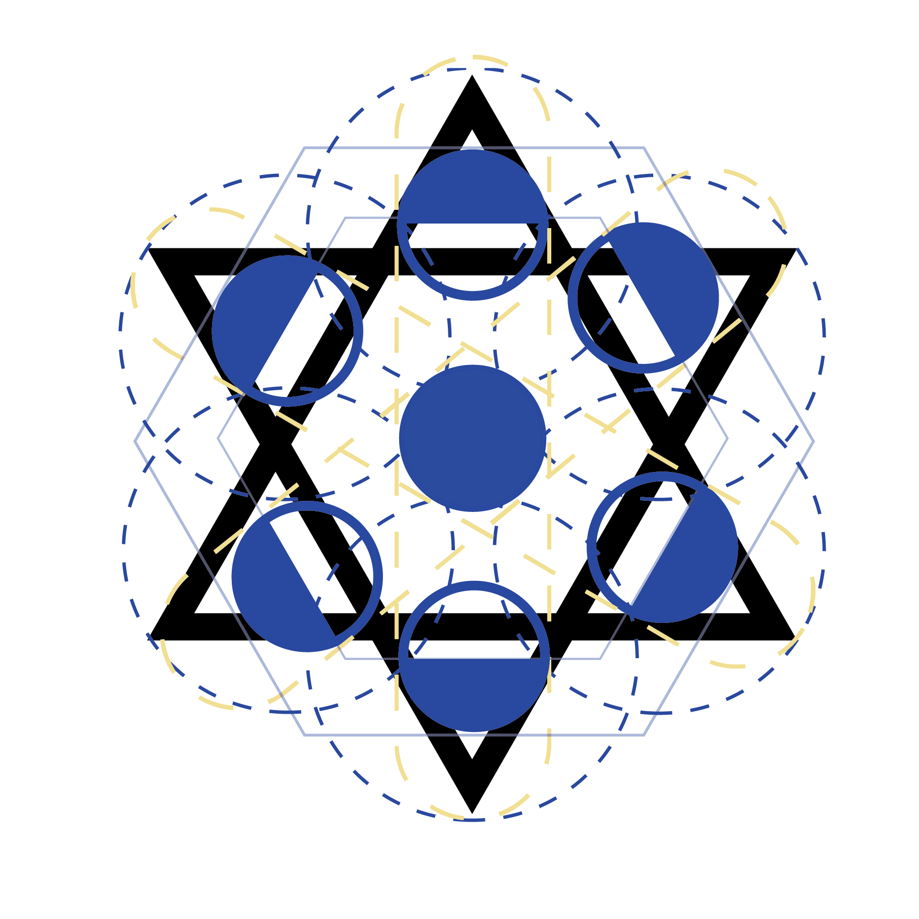
This updated logo draws on the Jewish lunar calendar while also representing people gathering together around a table.
What started as a pandemic-fueled food delivery service in Melbourne, Australia, The Social BluePrint has evolved into a wide-ranging resource guide and social calendar for the Jewish community. My design work with founder Sharon Lowe focused on togetherness, welcoming, and including homages to the worldwide Jewish community.
While the blue color (#0038B8) is inspired by the Israeli flag, the royal blue of the logo is derived from an ancient dye produced by sea snails. 🐌 A highly-prized color mentioned in the Torah, it was used for sacred Hebrew garments and tapestries. This blue-violet hue was called tekhelet, and though the production method was thought to be lost in medieval times, modern Jewish scholars believe they have identified the specific species of snail and techniques for making this prestigious color.

Cognizant of ongoing security threats to the Jewish community, Sharon wanted a logo that may not be immediately recognizable to anti-Semitic or violent individuals. I drew on my own Jewish identity to create a design that both features inclusivity and also immediately signals to folks that are familiar with Jewish iconography. This design is the meeting point between security and recognition within the Jewish community.
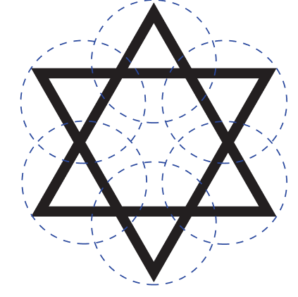
Research & Design Sketches






Typography & Brand Collateral
For continuity, I used the round, approachable Poppins font that is also available in the software The Social BluePrint uses for their email marketing. Splashes of Futura establish authority while also bearing historical progressive roots.


