Discovering your brand colors
It was exciting to work with Dianela Castellanos to put her passions in one place. Her website is a spot where she feels totally represented as she starts to establish her personal brand. By choosing soft colors and gentle lines, her site conveys peace, joy, and tranquility.
Building this personal brand and website for a budding business, it was important to both of us that she was able to make changes on her own schedule. With her vision in mind, I created the Dianela branding guide with variations on colors, her logo, photographic portraits, and typography. She is still determining exactly how she wants to present herself to the world, so empowering her with the ability to edit anytime was crucial. I took the time to guide her through using Squarespace so she can fully take her personal branding journey into her own hands.
The elegant, airy Meno Banner typeface offers luxury that’s shaped by time and experience, balancing the soft palate with poised typography.
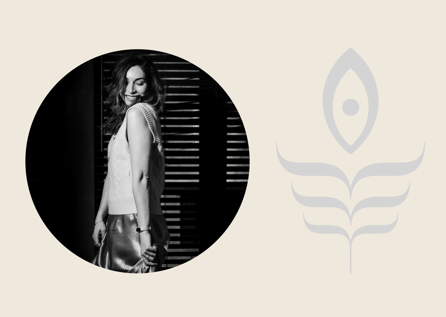
The logo is adapting the contrast of Meno Banner with the values of the brand - Balance, Grace & Growth.

Creating the logo was a fun challenge to translate the typeface into a new form with balance grace and growth. Below are some of the logo iterations and to get us to the final.
Photography
Logo Design
Creative Direction

• Custom Design
• Social Media Assets
• Photo Retouching


